Ghana Stock Exchange Data Visualization
Driven by growing interest in the Ghana Stock Exchange (GSE), I wanted to make its performance easily understandable through data visualization. Here's a quick look at how I brought the data to life:
Data Collection
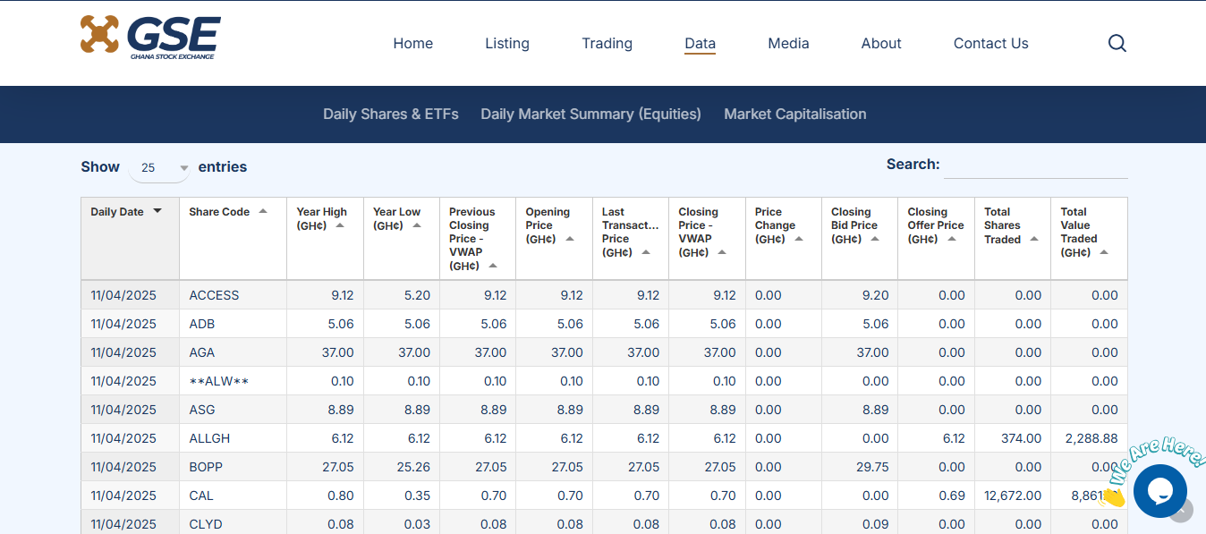
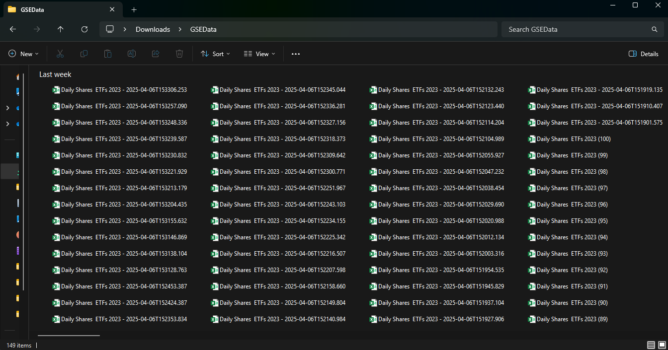
First, I used a web scraper to collect the historical daily trading information directly from the GSE website. This allowed me to gather the raw data needed for analysis.
Data Preparation in Power BI
Date Fix: During data preparation, I discovered a common issue: 56% of the dates had formatting errors. I resolved this in Power BI by using the "Using Locale" feature to correctly interpret the Ghanaian date format.
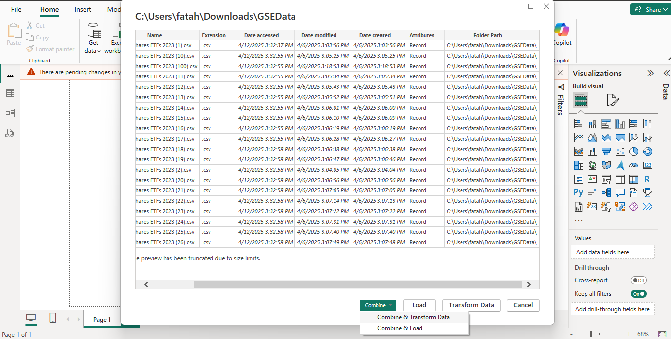
Analysis: With clean data, I then used Power BI for the analysis.
With the data cleaned, I proceeded with the analysis in Power BI.
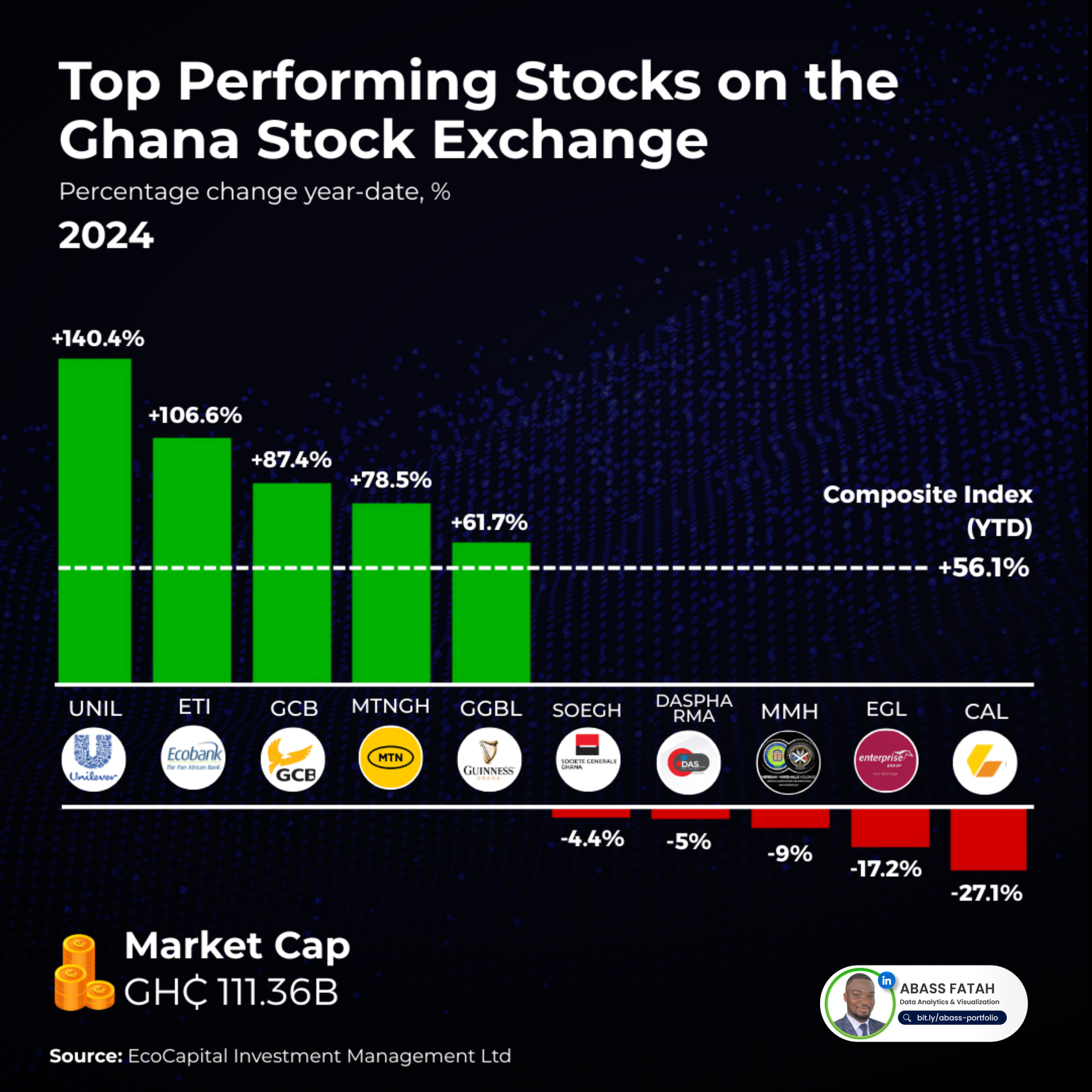
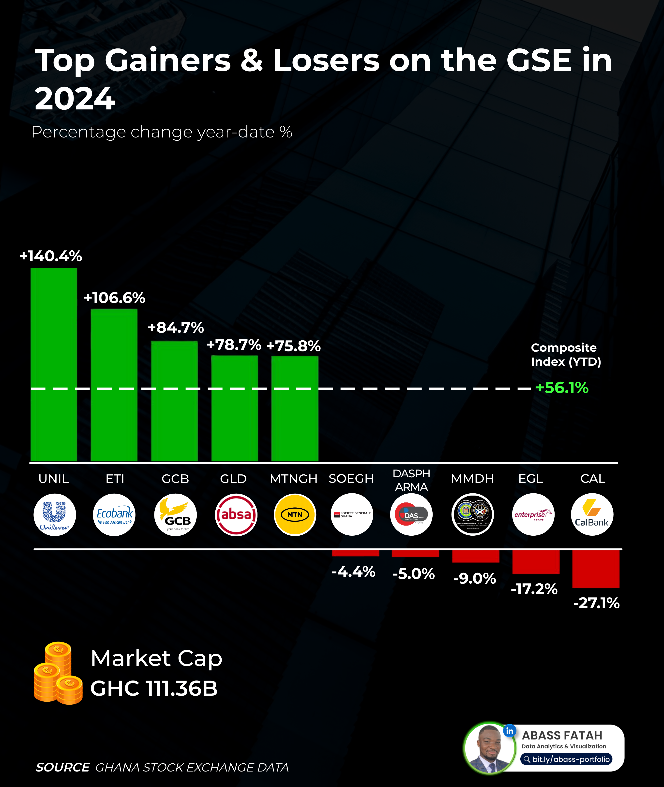
For the 2024 Top Gainers and Losers, the calculation was relatively straightforward:
- I determined the Price Change by subtracting the 2024 opening price from the 2024 closing price for each stock.
- Then, I calculated the Price Change Percentage using the formula:
(Price Change / 2024 Opening Price) * 100. - Finally, I visualized this percentage change for all stocks and highlighted the top 5 gainers and the bottom 5 losers.
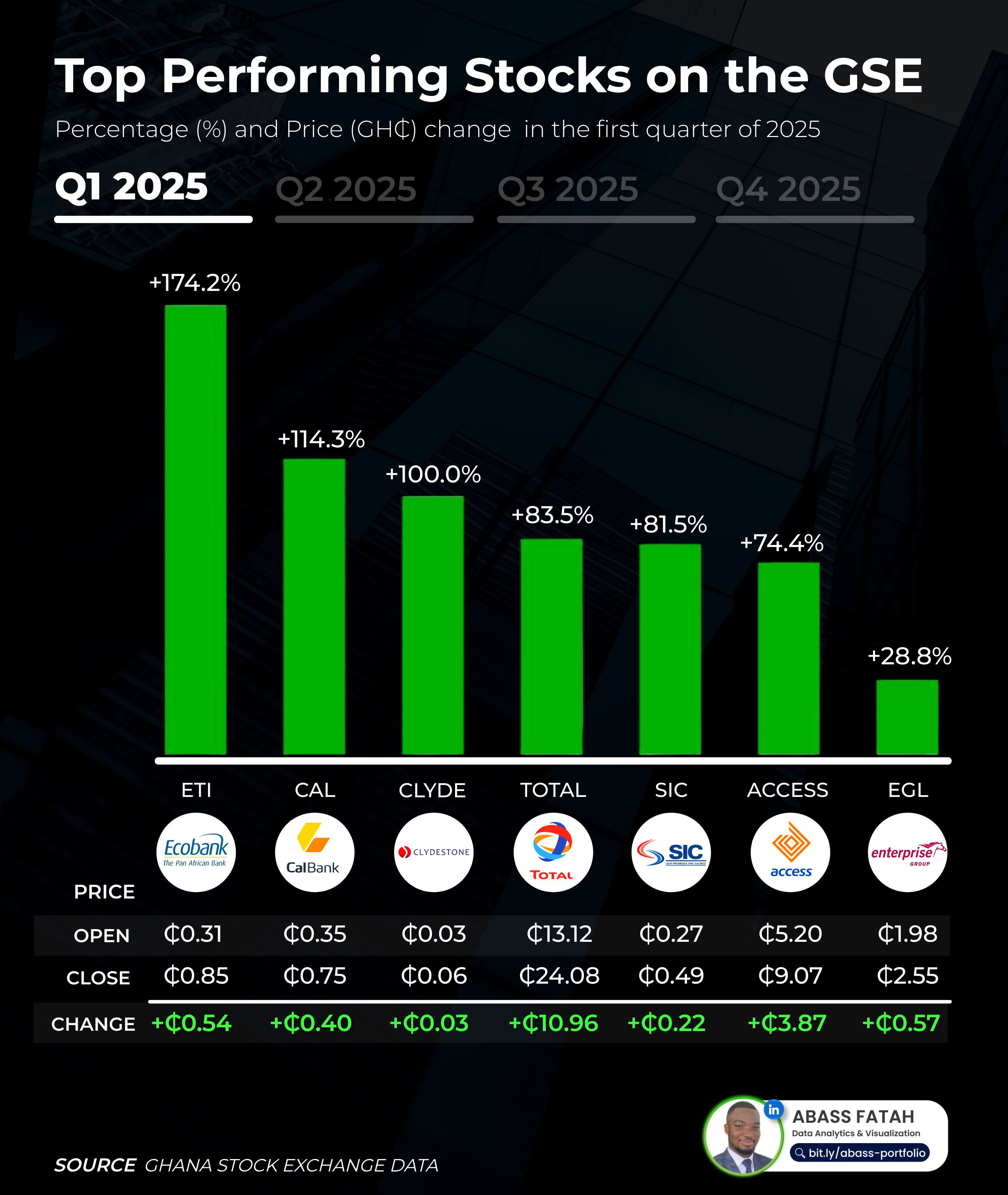
For the 2025 Q1 Top Gainers, the process was similar:
- I calculated the Price Change by subtracting the 2025 Q1 opening price from the 2025 Q1 closing price.
- The Price Change Percentage was then calculated using:
(Price Change / 2024 Opening Price) * 100. - I visualized this data to show both the percentage change and the absolute price change in Ghana Cedis (GH¢) for the top-performing stocks in the first quarter.
Graphic Design
Finally, to ensure the insights were communicated clearly and with visual impact, I exported the core charts from Power BI into Photoshop. Here, I refined the design elements and, importantly, added the company logos beneath their respective stock tickers. My aim was to make the analysis more relatable and intuitive, allowing viewers to easily recognize the actual companies behind the stock movements, rather than perceiving them as abstract financial concepts. This step significantly enhances engagement and understanding of the GSE's performance.